


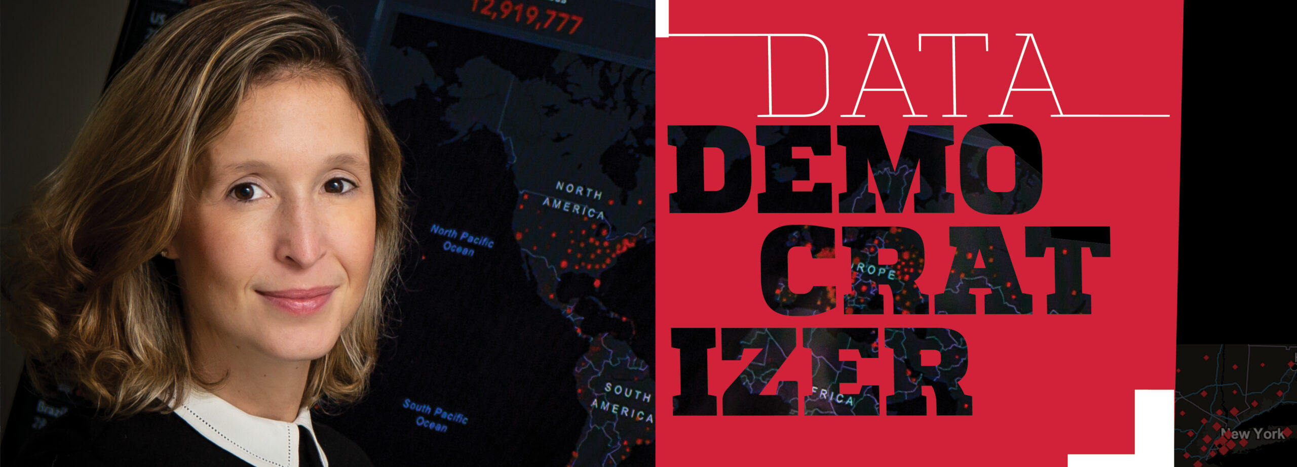
With her COVID-19 dashboard that proved critical to mapping the deadly virus’s trajectory, Lauren Gardner went overnight from an unassuming engineer to a global voice championing the value of data science in public health.
Lauren Gardner knows a measure of fame that engineers are rarely afforded. She did not invent a new gadget. She did not found a hot startup. She did not get rich with an IPO. She did it with data.
Gardner, an associate professor of civil and systems engineering and director of the Center for Systems Science and Engineering at the Whiting School of Engineering, is the primary driver behind the globally recognized COVID-19 dashboard. Throughout 2020, as the worst public health crisis in a century made a relentless march across the world, a minimalist map that began as a pet project between like-minded professor and graduate student, Ensheng Dong, transformed into a dashboard tracking cases, deaths, and, in time, vaccinations worldwide. It became the go-to resource for data scientists, epidemiologists, public health officials, politicians, journalists, and, yes, everyday citizens the world over.
The dashboard enjoyed a modest start. Gardner introduced it with a simple tweet on January 22, 2020, just two days after the first case of COVID-19 on U.S. soil was announced. Almost from the moment she hit send, Gardner was thrust into a spotlight she never expected or sought.
“It was immediate. Within hours, it just blew up,” recalls Gardner, who is the Alton and Sandra Cleveland Professor at the Whiting School. “I had a feeling when we created it that it would grow. What I didn’t know was that what we created would become the tool for the world.”
The COVID-19 dashboard became the most cited source for information about COVID-19, and Lauren Gardner became its reluctant-but-resolute face. Overnight, she went from an unassuming engineer to a global voice championing the value of data science in public health.
The world was watching. TIME named Gardner to its 2020 list of the world’s 100 most influential people. Then, this past fall, Gardner topped it, receiving the Lasker-Bloomberg Public Service Award for her work creating the COVID-19 dashboard and curating its underlying database. The Lasker Foundation credits Gardner for creating “the world’s most influential source for real-time reliable and easily accessible data” about COVID-19’s spread and outcomes.

For almost 80 years, the Lasker Foundation has recognized individuals and organizations who have improved the public’s understanding of medical research, public health, or health care. The public service award is widely acknowledged as the highest-profile recognition in public health communication. Past winners include Bill Gates and Melinda Gates, Betty Ford, Anthony Fauci, Henry Heimlich, the National Institutes of Health, and Médecins Sans Frontières (Doctors Without Borders).
“I am extremely honored to be awarded the Lasker-Bloomberg Public Service Award. It’s been an exceptional experience to play such an integral role in keeping the world informed during a global public health crisis, and perhaps equally important, changing the expectations around public access to data and information,” Gardner says. “I am also excited for the opportunity to highlight the value and impact of quality data science and engineering. These tools, combined with good science communication, are critical for addressing the multitude of problems facing societies today, whether that be a public health crisis, climate change, or improving basic access to services in a community. I sincerely hope these tools and skill sets continue to be invested in and integrated into the public sector in the years to come.”
Engineering Intersections
How an engineer with a background in transportation engineering ended up as a leading voice in global public health is a story in and of itself. Gardner counts herself among a growing branch of engineers who use the traditional tools of civil engineering to model the spread of diseases.
“I began by studying the intersection between human mobility and infectious disease,” Gardner explains. “The tools behind it all, specifically the mathematical modeling, flows out of engineering.”
It turns out that the movement of people, data, objects, anything really, between nodes in a network can be adapted to the movement of disease among people and cities. These days, it is not uncommon to find data scientists, like Gardner, from various engineering fields applying similar skills to broad societal concerns, from traffic jams to the opioid epidemic.
“We’ve branded ourselves as ‘systems engineers,’ an interdisciplinary science grounded in data and math models to solve problems,” Gardner says. “These are interdisciplinary problems, which rely heavily on data and modeling tools, to support evidence-based decision making.”
“When I first saw the dashboard, I was stunned that it was an engineer behind it,” says Beth Blauer, a professor and the associate vice provost for public-sector innovation at Johns Hopkins, who heads the Coronavirus Resource Center. “But, then again, that’s the Hopkins way, finding talent that cuts across the silos of the university. That’s Lauren.”
The dawning realization that their dashboard was about to explode produced in Gardner’s team a momentary what-havewe- wrought soul searching. At first, Gardner imagined (hoped, really) that some higher-profile organization—the Centers for Disease Control and Prevention, the World Health Organization, or the National Institutes of Health perhaps—might assume the responsibility for the dashboard or offer up its own variation. But that moment never came.
Gardner and her small team of data scientists would soon face a go/no-go decision, the answer to which would consume the next three years of their lives.
“Our first reaction, ‘We can’t do this,’ evolved into ‘We have to do this … and we have to do it well,’” Gardner recalls of apprehension turning to resolve.
From then on, the only question was: How?
Stars Align
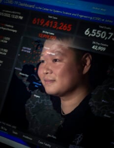
It was measles that first brought Lauren Gardner and Ensheng Dong together. Dong was among the first recruits Gardner made when she arrived on the Homewood campus in 2019. Dong’s graduate work modeling measles outbreaks was just getting underway when COVID-19 emerged. His skills and Gardner’s research interests quickly aligned.
expertise was vital to the COVID-19
map that he and Gardner launched
in January 2020.
“Ensheng and I began tracking the earliest cases of COVID and decided to build out a dynamic dataset and make it open for the research community,” Gardner says.
The timing was fortuitous. In the latter part of 2019, Dong was keeping a close eye on the mysterious new virus emerging in his home country. A native of Taiyuan, a city of five million in northeast central China, Dong had recently completed his master’s degree in geographic information systems at the University of Idaho. While there, he did an internship with the GIS mapping company, Esri, charting health data on maps. Dong’s expertise in mapping health data was not the only head start the team would enjoy. His facility in Mandarin proved an invaluable asset in parsing the spotty, often inscrutable information about the nascent disease seeping out of China.
“Chinese fluency, data science, mapping, and public health experience all merged at just the right time,” Dong says.
It was a potent brew. But the researchers still lacked a key ingredient: data.
Putting Data on the Map
At this point it was early January 2020. Almost no one was aggregating information about where and how the disease was spreading worldwide. The U.S. had yet to report a single case. The World Health Organization was pushing out updates, but in flat tables in PDF format. Few outside public health fields could understand them, much less internalize their meaning.
In the void, Gardner and Dong did what engineers do—they began to build a database themselves. From necessity, they went from modelers to aggregators, pulling together any and all sources into a single database. In the earliest days, that meant inputting numbers by hand and updating them periodically throughout the day.
“Ever since, I’ve been wearing two hats, doing two completely parallel jobs of running the data collection, while also using the data in various modeling projects to help improve our understanding of COVID-19,” Gardner says.
Among the team’s more prescient decisions was the one to plot their data on a map. Dong’s GIS experience and ability to transform data into easy-to-read, easy-to-grasp visual representations made the dashboard resonate in ways that plain numbers never could. “Mapping was essential to the dashboard’s popularity,” Gardner says. “That simple, intuitive, and accessible nature of the dashboard is all Ensheng. He pushed for the mapping.”
Mapping democratized the data. Suddenly, everyone from inveterate data geeks to the lay public could visualize COVID-19’s reach. The dashboard was deluged. Servers crashed. Dong dropped a course to keep up. Gardner became a household name.
Scraping By
With all attention focused on their data, seemingly small decisions grew in significance. Gardner and Dong chose to plot their numbers on a stark black background with red dots representing the scale of an outbreak—larger dots meant more cases, more deaths. Intense debate about the sizing and color of the dots ensued. Making the dots too large, the researchers worried, would risk overemphasizing the disease’s scale and lead to hopelessness. Undersizing them, on the other hand, might mask COVID-19’s true impact and compromise response efforts.
Soon, collecting data by hand became overwhelming. To meet those challenges, Gardner and the team partnered with Johns Hopkins Applied Physics Lab (APL), Dong’s former employer, Esri, and the Sheridan Libraries to help build out the more extensive data collection infrastructure to crawl the internet and news sites for reports of new cases and deaths and “scrape” relevant numbers, entering them in the database automatically. Some 3,500 data points arrived every half hour.
While scraping eased the burden of collecting, compositing, and curating data, it raised new concerns about the data’s validity and the potential for double counting. Those worries, in turn, begot new algorithms trained to spot anomalies among the incoming numbers. Much time and innovation went into those validation technologies, Gardner says, but they did not completely erase the team’s worries.
“I had a nightmare that I had gotten some data from French Guyana wrong,” Dong recalls of the way a sense of duty played on his psyche. “When I woke up, I went to my laptop to check that the data was right.”
Insight from Imperfection
Despite the team’s Herculean collection efforts, there was no escaping the fact that their numbers would never be perfect. Reporting methods country to country, state to state, and county to county, were too inconsistent, if they were available at all. Data points didn’t always align. A confirmed case to one authority might only be a possible case to another.
Politics crept in. Some leaders clamored for more testing, while others questioned the value of testing at all. Data became a piñata. It grew so intense that Gardner and her team initially refused federal funding in fear it would compromise credibility. Other than a small grant from the National Science Foundation in mid-2020, the dashboard has received no direct federal funding.
“Even though we felt like the data collection and sharing should be the government’s responsibility, we were seriously concerned with the ongoing politicization of the pandemic, and believed acting as an independent source for information was critical for retaining public trust,” Gardner recalls.
Through it all, Gardner remained unbowed. Imperfect and incomplete data were better than none at all. The patterns they revealed proved crucial in anticipating the disease’s next moves, assessing the severity of its impact, and developing public health policies in response.
“All we ever claimed is that we accurately reported what was being publicly reported,” Gardner says. She suspects the true number of cases might have been 10 or even 20 times higher than reported. Perfection was the goal, but she knew it was an impossible standard.
“What we are doing is engineering, not epidemiology,” Gardner says. “Postprocessing of the data to smooth the trends out, fill the gaps, and clean up the anomalies is still required to accurately represent the true disease dynamics, and more generally, improve our understanding of COVID-19 risks. But, the availability of data is the necessary first step in this process.”
Gardner’s faith in the data was rewarded through insights that helped public health decision makers set effective policies. These insights also identified profound inequities inherent in the public health system.
“In every crisis there are always disproportionately affected groups,” she says. “Data can help expose those truths. Hopefully, there will be more effort to address those kinds of things in the future.”
Storytelling likewise proved a crucial piece of the dashboard puzzle. In that respect, Blauer’s Coronavirus Resource Center was an invaluable ally. Good data is important, but it needs context. The Coronavirus Resource Center helped frame the nuances in the data in new and deeper ways.
“We were in a continual environment of misinformation back then,” Blauer recalls. “The Coronavirus Resource Center’s storytelling gave a voice to the data, allowed us to assert our expertise and build trust to blunt the force of that misinformation.”
The CRC’s storytelling explored new meaning in the data and the trends. Using dashboard data, the CRC brought to light that lower-income people and people of color were bearing the brunt of COVID-19’s wrath, for instance. The dashboard became integral to CRC’s influence and vice versa.
Gardner and Blauer worked very closely and had multiple conversations each day to help support the broader universitywide CRC effort. Gardner focused on leading the team collecting the data and delivering the global map, while a large team at CRC focused on the communication aspects of the data and contextualizing it.
“Lauren has a unique combination of skills,” Blauer says. “She understands the data, but also that key translational piece to tell us what it all means.”
“In every crisis there are always disproportionately affected groups. Data can help expose those truths. Hopefully, there will be more effort to address those kinds of things in the future.”
— Lauren Gardner
Life Lessons
Looking back, Gardner says the past two-plus years are still a blur. “The first year was pretty insane the whole time,” she says.
One data point that remains unreported is that Lauren Gardner did it all while pregnant. In December 2020, she welcomed a new baby and commenced a maternity leave in early 2021. When she came back to work, she took a more strategic role with the data management, and returned to the work she loves most—creating models, exploring the meaning behind the data, and applying the lessons they impart to help support evidence-based policy and decision making.
Her continuing influence now includes regular consultations with the CDC and the White House to improve their ability to gather data and to effectively communicate what the data mean—a shortcoming the pandemic laid bare. She is also involved in efforts to design and build sustainable infrastructure for future data sharing and modeling that will help us be more prepared for the next pandemic. She is folding into her models many disparate forces influencing infectious disease, including data on climate change, human mobility, policy initiatives, and behavioral and sociodemographic information. That infrastructure does not yet exist, but it is ripe for engineering’s unique perspective and skills.
As the dust storm of the last two-and-a-half years has settled, what endures for Gardner is an affirmation that, however incomplete or imperfect the data may be, it can still tell us volumes about a deadly disease’s trajectory. And that knowledge saves lives.
Whatever the future holds, Gardner is certain engineers must play a leading role. They are problem solvers after all, and these large societal challenges are, at their core, engineering problems. These problems deserve the very best the tools the field can offer—mathematics, computer science, data science, and artificial intelligence. Whether the next challenge takes the form of climate change, another pandemic, or some other unexpected crisis, Gardner says viable solutions will always require timely, high-quality, accessible data, presented in a way that’s understandable and actionable, to produce the very best decisions possible.