
From navigating traffic to choosing a movie on Netflix to adjusting our sleep schedules for optimal health, we rely on data to inform many decisions we make each day. But how do we know we have the “right” data or that we are reading it correctly? In the course Storytelling with Data, Andy Ross and Jenna Frye, associate teaching professors in the Center for Leadership Education, demonstrate the importance of ethically collecting and interpreting data. Through hands-on projects that encourage experimentation, students also learn how to design effective data visualizations that are tailored to specific audiences. .
Key Takeaways

Data Isn’t Neutral
Through the project Mapping and Unmapping, students examine maps, including cylindrical Mercator projection maps, which are designed to make it easier for sailors to plot straight-line courses from constant compass bearings. Mercator maps also distort land masses (Greenland appears roughly the same size as Africa, though Africa is 14 times larger), which in turn distort our cultural understanding of these continents. Students then explore geospatial data by designing their own interactive maps.
“Design is not just about aesthetics. It is fundamentally about communication. Small decisions can determine whether someone immediately grasps the main idea or misses it entirely.”
— Michael Baum, Engr ’27, computer science
More Than Graphs and Dashboards
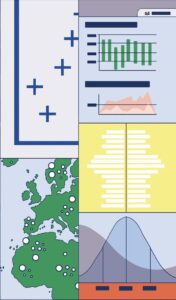
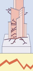
Storytelling with Data goes beyond more common methods of data visualization to incorporate tactile artifacts and interactive systems. Students learn to use several computer programs, such as Tableau and Twine, as well as to employ design principles including color, balance, visual hierarchy, and even motion graphics. A data sculpture assignment also invites students to create a 3D visualization that engages more than one of the audience’s senses.
“I learned that the first thing you should know is your target audience. Effective communication requires tailored messaging, visuals, and details that resonate with the audience’s background.”
— Aiden Kim, Engr ’26, applied mathematics and statistics
Know Your Audience
For their final project, students are tasked with creating a digital narrative with multiple data visualizations that speaks to their audience, such as a technical team, executives, or a more general audience, without significant background knowledge on the subject. To do this, they must prioritize their audience’s needs while creating an engaging, memorable story.
“Data is constructed through human choices about what to measure, how to categorize it, how to frame those measurements and, unfortunately, how to weaponize it. That’s why developing the ability to question and deconstruct those choices is just as important as learning to analyze the numbers themselves.”
— Instructor Jenna Frye
— EMILY MYRICK
Illustration by Fien Jorissen